


Image: Pexels
Compared to all the businesses that exist, the right branding is crucial for financial institutions. Banks require public trust, but can a logo help banks appear trustworthy and secure?
Believe it or not, there is actual visual science behind the creation of the top banks in Southeast Asia. In this article, we take you behind the scenes into the principle of designs behind these banks and their respective logos:
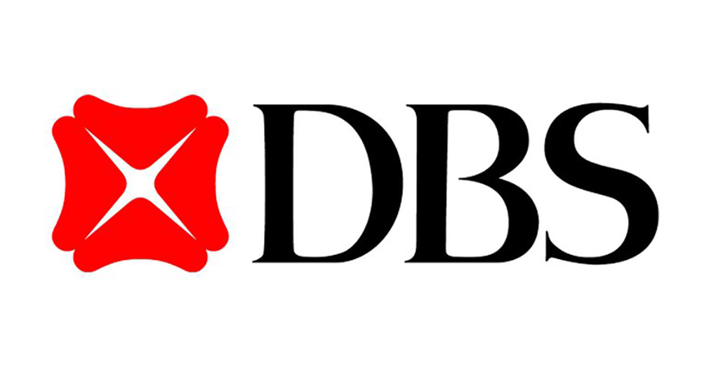
Image: DBS
Design shape
In 1968, the DBS Bank logo consisted of only the design shape where you can see four identical rounded shapes forming a larger shape. The smaller shapes are comparable to boomerangs or arches while the larger shape resembles a flower.
Typography
DBS Bank made a slight change in 1998 by adding some typography to the design. Other than the four shapes being pulled closer to each other, the logo now has an elegant “DBS” lettering. The font appears to be the Domaine Display Medium type that features a refined display serif font.
Colour
The design in 1968 stood out with its red-filled shapes over the white background. In 1998, the design underwent some hue modification with a calmer, darker red.
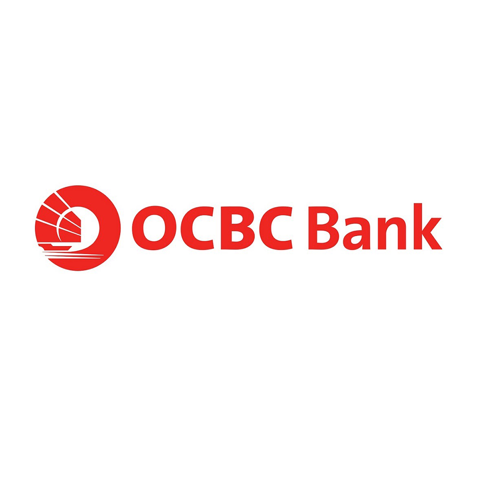
Image: OCBC
Design shape
During the late 1920s, OCBC (which was known as Oversea-Chinese Bank) featured a Chinese junk. This spoke to the bank’s rich influence in history as one of the biggest banks in Southeast Asia and it even survived the aftermath of World War II. The depiction of the Chinese junk featured all the sails and masts with even an imagery of the sea to showcase the bank's fortitude in riding the waves and successfully sailing forward.
Typography
In 1989, letterings were incorporated into the revamped logo. The type in the OCBC Bank logo featured a highly legible sans with classic proportions. The simplicity of the type allows for the slightly intricate emblem to stand out and become instantly recognisable.
Colour
The new and improved logo from 1989 also featured a strong use of red. Although the colour choice was generic, the pairings of the lettering and emblem allowed for the logo to remain impressionable among other competitors sporting the same hue.
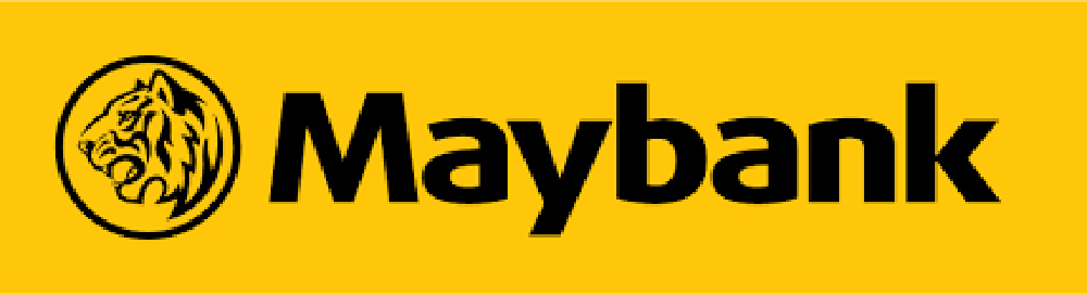
Image: Maybank
Design shape
Since its establishment in 1993, Maybank’s logo featured the iconic “Maybank” lettering in black inside a gold rectangle. The tiger was also part of the design element but it had a heavier stylised view of the tiger’s head inside a black ring. The entirety of the design looked squashed and proved more difficult to read. In 2011, a sharper design with a clear side view of the tiger’s head was incorporated into the revamped logo.
Typography
In the refurbished logo that was introduced in 2011, the type shares distinctive similarities with FF Dax Wide ExtraBold. This choice of lettering resulted in a more modern appeal to the design in comparison with its predecessor.
Colour
The usage of yellow in the design signifies heritage, wealth and prosperity specifically in parts of Asia. Meanwhile, the usage of black on the lettering and the tiger element represents the bold and courageous personality of the brand.
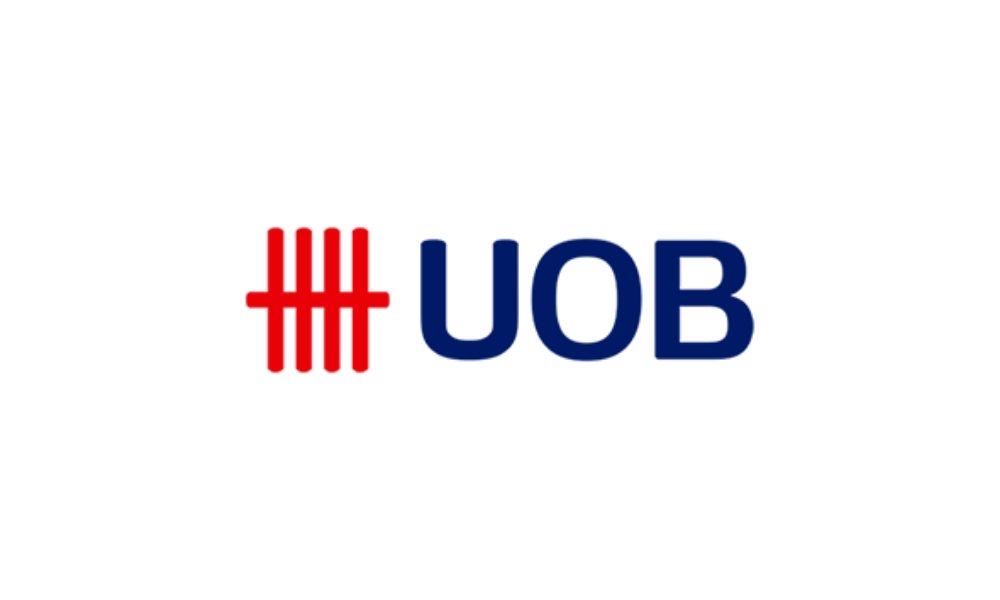
Image: UOB
Design shape
Monograms were all the rage back in 1935 when the United Chinese Bank (now known as United Overseas Bank) and its influence was evident in the original logo design of the bank. The logo featured an overlap of the bank’s initials. The downside to this was that it was virtually impossible to know which order of the letters followed one another but back then, the priority was vague recognition as opposed to distinctive recognition of the brand through the logo.
The bank’s logo underwent several reconstructions in 1965, 1972, 1999 and 2015. In the 1965 version, the “seal” theme was more pronounced in conjunction with the bank’s first overseas branch in Hong Kong. The beginning of UOB’s iconic logo began back in 1972 when the red five-bars were adopted. The symbolism referred to the traditional Chinese way of counting using tally marks. The usage of tally marks was not exclusive to China though, as the oldest tally sticks go as far back as 35,000 years ago.
Typography
The type that was incorporated into the more recent logo designs is clean and clear. The shape of the letters was more rectangular in nature which connotes stability.
Colour
Red has always been the colour of choice since the inception of the bank. In the early days, the red hue had a more vintage tint while the newer design is a sharper and vibrant red. The lettering in the latest design featured the usage of blue to provide a balance and distinctive element to the logo design in comparison to UOB’s competitors.

Image: CIMB
Design shape
The Commerce International Merchant Bankers (CIMB) logo design was apt for the time of the company’s inception where the focus of the designs was on the acronyms that were highlighted in a grey outline. The design evolved from lettering to the use of a geometric emblem which symbolised movement, growth and wealth.
Typography
The CIMB logo that is almost instantaneously recognisable today uses one sans-serif typeface with bold and thick lettering. The typeface bears similarities to the famous Avenir font family.
Colour
Burgundy is the colour of choice for the latest CIMB logo which represents confidence, luxury and power with the added red and white details to give a feel of professionalism and loyalty.
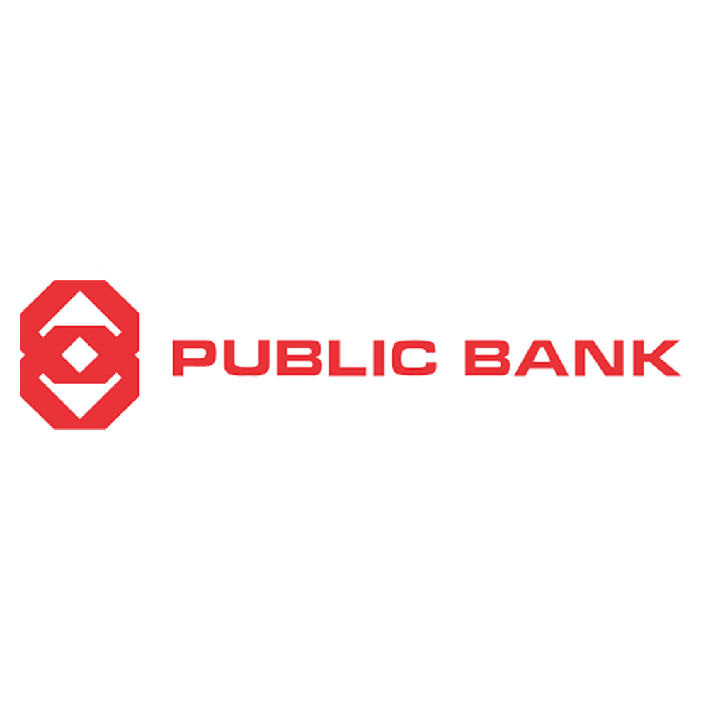
Image: Public Bank
Design shape
Geometry was a significant influence in the design of Public Bank Berhad’s logo. The design features two interlocking octagons denoting the domestic and international connections of the Group. The usage of the two octagons also implies a sense of security, strength and stability.
Typography
Aligned with the theme of stability and strength, the type that bears similarities to the font used in the Public Bank logo is Microgramma.
Colour
Staying within the theme of simplicity and elegance, the logo features a single-colour use of red.
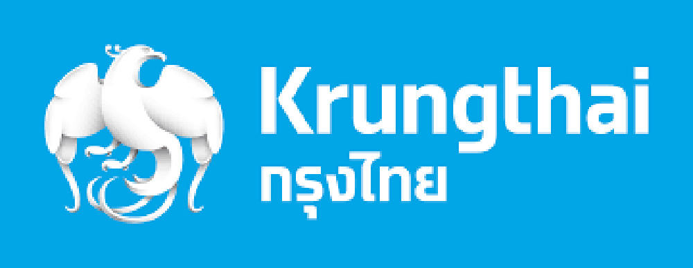
Image: Krungthai
Design shape
Detailed imagery of the Vayupaksa bird is used as the main focus of the logo to represent freedom and greater agility.
Typography
The lettering of “Krungthai” uses a modern and chic font type with gentle curves to invoke a sense of friendliness and welcome.
Colour
Sky blue is used to represent the bank’s modernity, freedom, power of enthusiasm and determination to fly towards advancement.
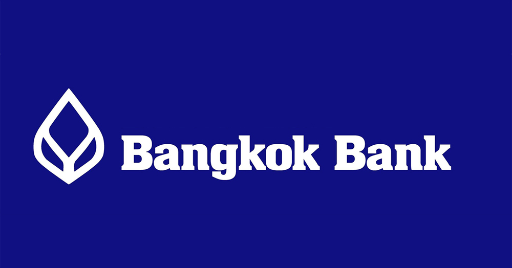
Image: Bangkok Bank
Design shape
Founded in 1944, the Bangkok Bank is one of the largest regional banks in Southeast Asia as well as Thailand’s market leader in corporate and business banking. The logo features a geometric outline of a lotus, a symbol signifying resilience and strength. It is also a strong symbol of spiritualism in representing purity and transcendence.
Typography
The lettering for the Bangkok Bank appears to be an uncategorised typeface. However, elements of a bold Serif typeface can be vaguely spotted.
Colour
Navy blue appears to be the primary colour with white fonts for the logo to stand out. Blue often symbolises a sense of security and trust – an apt choice for a financial institution.
Bank Negara predicted that the financial system will grow at an annual rate of 8-11%. If your company falls under this sector, you will need all the support you can get to stand out against your competitors.
Here are five other reasons why Brandripe is the smartest investment you will make:
If all of this sounds good to you, book a 15-minute VIP Demo Call with us and we will give you the grand tour. Just like your customers, we want you to place your faith in us to meet your visual needs. You can also visit our Help Centre to understand our design process and get helpful tips to make the most out of your plans with Brandripe.