

Data is king! Welcome to the digital age where data is the backbone of your business or brand. It is behind every single decision that is made these days.
As you know by now, as a business or brand owner, having the right analytics in place also drives key business decisions; to sell or not to sell, to list or not to list.
With data, you can understand how consumers behave and how they feel about your product, services or brand overall.
This highlights the importance of data visualisation; not just for your internal stakeholders, but also for the target audience that is interacting with your brand, product or services.
In layman's terms, data visualisation is the process of turning data into a compelling visual story through the use of graphics, like charts and graphs.
When you incorporate data visualisation as part of your marketing collateral, it helps not just sell the product or service to the consumer but also provides an education that compels them to consider why such a product or service is important to them.
After all, dressing up the shop window is the last stage of the funnel. What really gets people through the door is a good understanding of how your product or service can solve their problems.
 Image: Pexels
As we mentioned multiple times before, we’re all for a great copy. The best copywriters can create compelling messages that will spark an interest in your customers, and eventually drive them to engage with your business.
That being said, we live in a world where we rely heavily on visuals to make us stop and pay attention. So, when it comes to presenting data, long gone are the days where you need to present investors, customers or even someone who’s interested in finding more about your business out of curiosity, with a 60-page prospectus explaining your data and findings.
These days, it’s all about taking things up a notch and simplifying things in a way that would enable just about anybody to know what you’re all about in mere seconds.
If you’re interested in finding out how you can do exactly this, here’s a breakdown of the key elements that you’ll need to keep in mind when designing data visualisation.
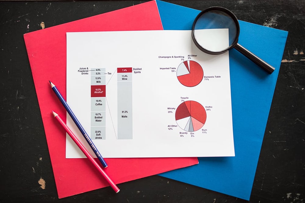
Using graphs and charts is a great way to help collate data, especially when there's quite a volume to be presented. Typically, we use graphs and charts when indicating comparisons or to show trends and scales. However, that doesn't mean that simply any graph or any chart would do.
For instance, line graphs are used to compare changes over the same period of time for more than one group or category. This makes it easier to see the relationship between two (or more) sets of values. However, line graphs are only useful if the axes follow the same scales.
It's not recommended to have more than four lines on one graph as it then makes it difficult to discern data.
Here’s an example of a line graph:
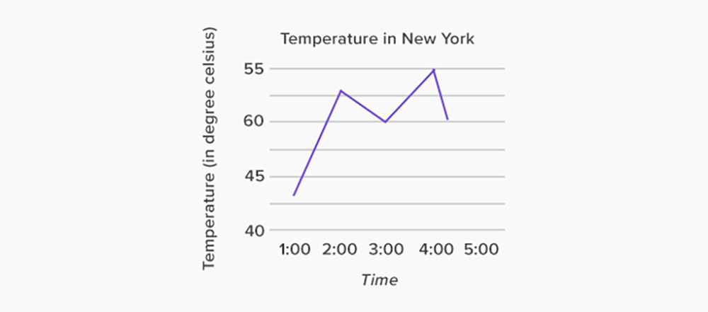 Image: SplashLearn
There is a selection of charts that you can pick to best present your data, with column and bar charts widely used as crowd favourites.
Bar charts are very straightforward; typically used to show values across categories when the duration or category text is long, or they are designed stacked onto one another to compare parts of a whole (relative and absolute) and change over categories or time.
Column charts, on the other hand, compare values across a set of different categories or also goes to show information about parts of a whole across different categories. Both bar and column charts are not too dissimilar in design, with their orientation impacting the type of data to be displayed.
Here’s a common example of how you can do this:
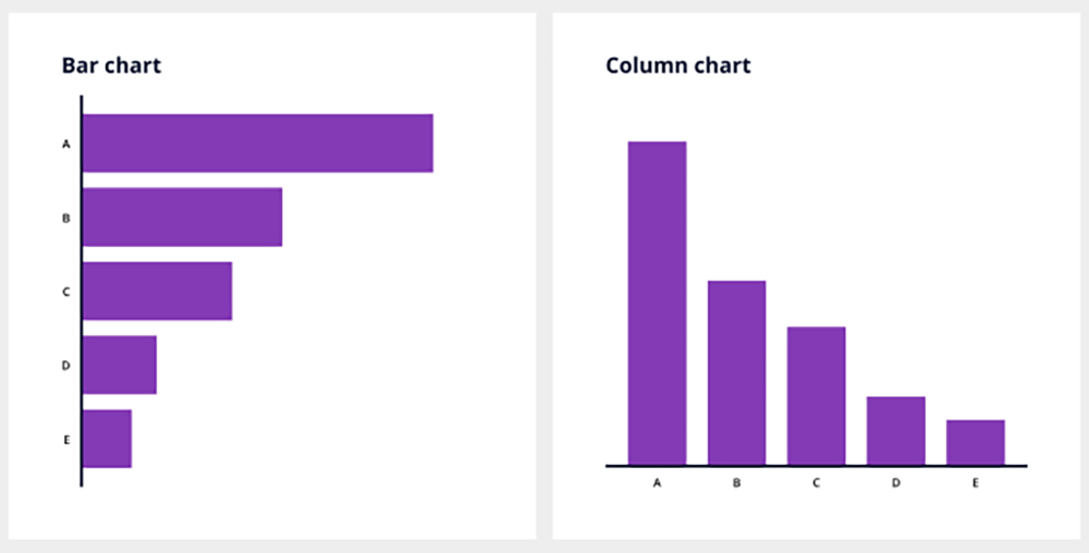 Image: Vizzlo
Many times when we think of data visualisation or any form of graphic design in general, the texts are not always the centrepiece of content. In fact, texts are almost usually frowned-upon, with graphics and visual elements taking the most of a target audience's eye.
From labeling your data's legends to titles and annotations, whatever text that you squeeze in together with your whole data visualisation highly influences and persuades a target audience.
Hence, it is crucial that each label speaks for itself, and not by an avalanche of copy.
Numbers are in fact considered and widely accepted as a form of text, too. You can position this to mark or indicate a special date, integrating that with a bit of wordplay to catch attention and distinguish special dates.
The most important key principle to remember when it comes to data visualisation design and utilising various formats such as graphs and charts is actually ensuring that you have chosen the right colour schemes.
From labelling data to differentiating one value set to another, choosing the right colours to display your data is more about ensuring that your target audience doesn't end up confused or turned off by the data.
The rule of thumb when choosing colours for your data includes;
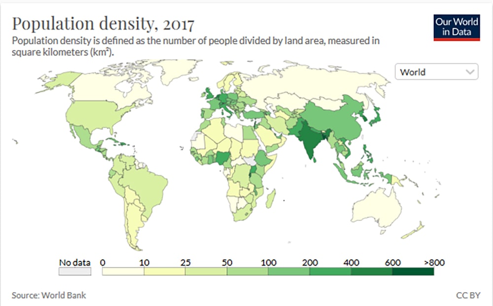 Image: Our World in Data
We have actually discussed the topic of choosing the right colour schemes for your brand here, here and here – so you might want to take a look at those too, especially if you’d like to ensure that your data visualisation design tallies with your brand identity.
Regardless of what type of content or materials we consume, having visuals helps us not only stay engaged but also makes for better visualisation of the intended message.
Using images, icons, and shapes can help provide additional context for your data. One way you can do so is by using pictograms. A pictogram is basically using a combination of repetitive icons and shapes to represent and simplify data and concepts, making it more memorable and less heavy to digest.
The best instance to use pictograms is when you're communicating data on the magnitude of an important statistic or visualising a fraction or percentage, indicating progression trends when it comes to status reports or organisational goals – or even as a visual summary of a set of survey data.
If your data is centered on your brand or product ratings and ratios, using pictograms is a great way to help showcase the more pertinent set of data.
For example:
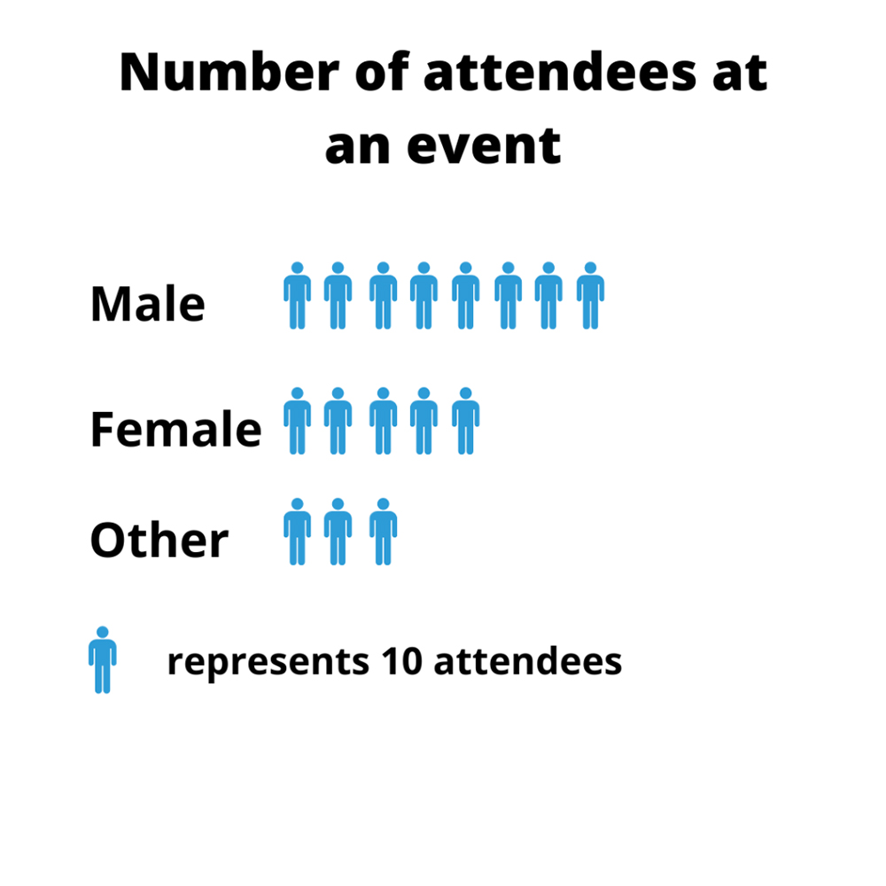 Image: Formplus
Screenshot from Brandripe explaining multiple, important things in visual format
While all the basic principles mentioned previously should be able to help you increase the effectiveness of your data presentation, there is a much easier and more efficient solution to your data visualisation needs.
This is by, of course, hiring an experienced team of graphic designers at Brandripe.
Before you say anything, we have some pretty good reasons why this would be your best option yet.
Think about it; you’re probably already juggling so many things such as day-to-day operations, upkeep, accounts and more. Figuring out a way to snag more potential clients or educate your clients is definitely top on that list, but it is a hard task that can be made much, much easier through a partnership with Brandripe.
You'll not only have access to graphic design support that comes with a guaranteed 24 to 48 hours turnaround time but also the flexibility to make unlimited revisions – which is a key value add for heavier and more factual content such as data visualisation that requires multiple levels of fact-checking and input from your stakeholders.
You won't get just a churn-in, churn-out experience with us. Our team has been trusted partners to prominent brands such as Allianz and Royal Canin, but also extended support to over 100 SMEs, marketing agencies and startups. You could be next!
Be it a one-off monthly subscription or a longer-term plan, you’ll get matched with a designer that best suits your design requirements and brand, without burning a hole in your wallet.
But we’re not here to talk you into signing up with us immediately. Let’s have a chat about all things data and visualisation first and see where we go from there.
Talk us through what you have in mind and what you wish to present to your audience, and we can then talk about what we have in mind on top of giving you a tour of our dashboard and how things work around here.
We’re ready to turn your most complicated data into a visual that pops and engages with your audience.
To find out more about Brandripe and how we operate to ensure your success, visit this page. Otherwise, you could hop on that 15-minute VIP Demo Call with us and hit two birds with one stone!
Have a lot to type out and explain instead? We welcome emails at hi@brandripe.com too.